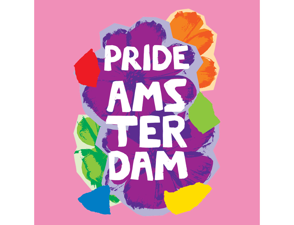
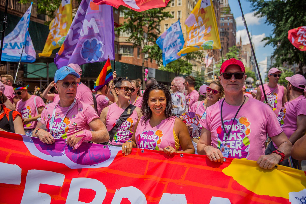
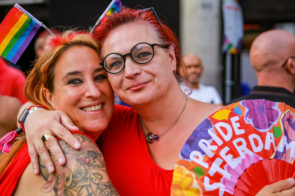
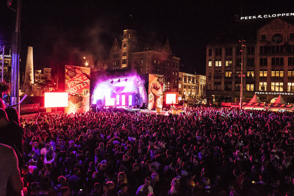
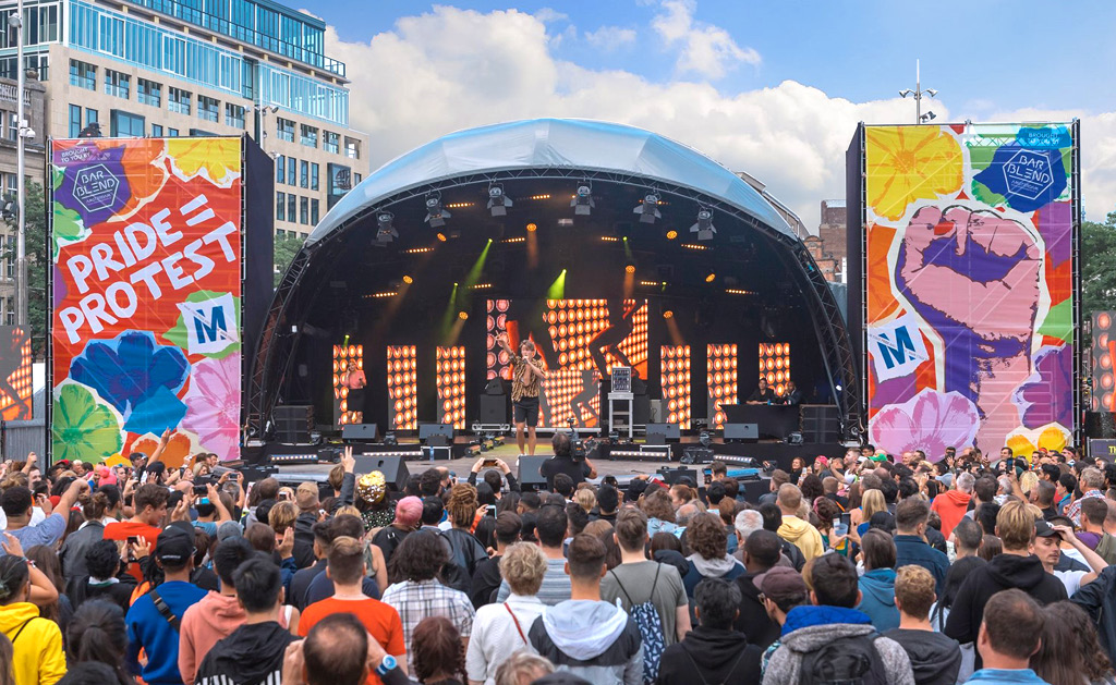
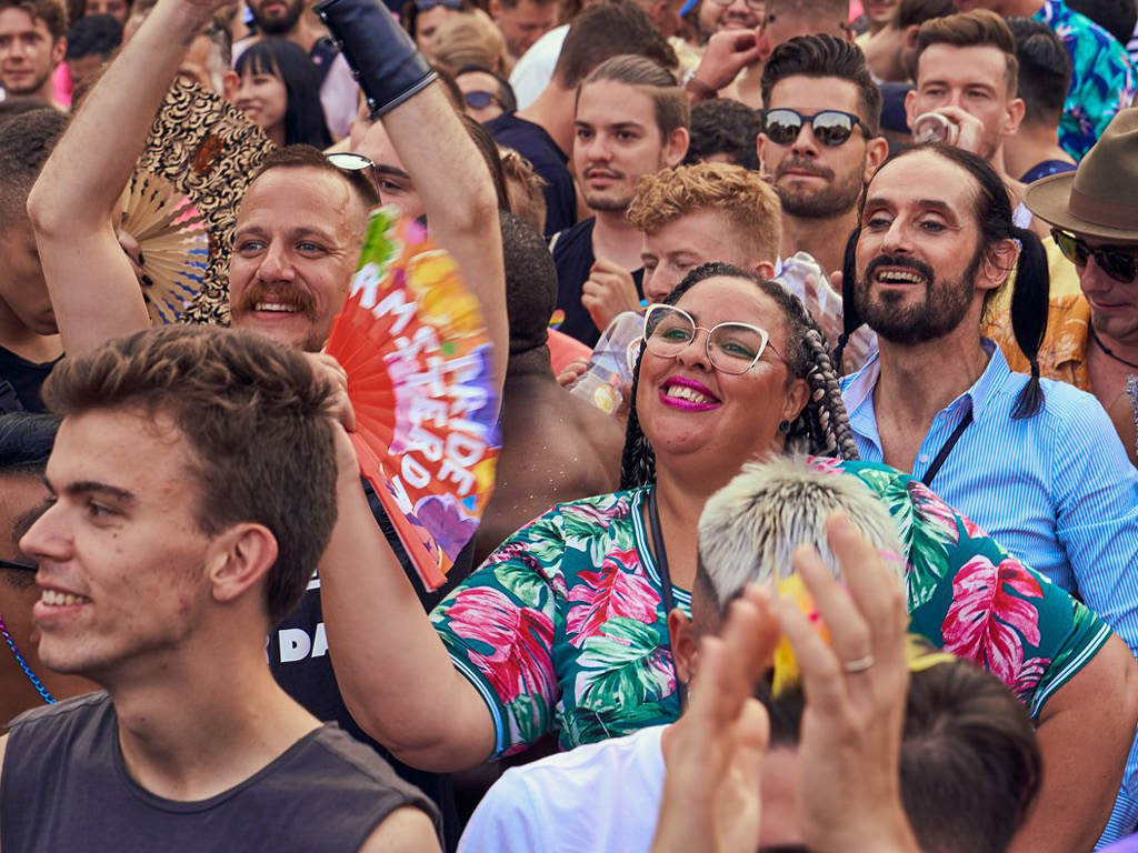
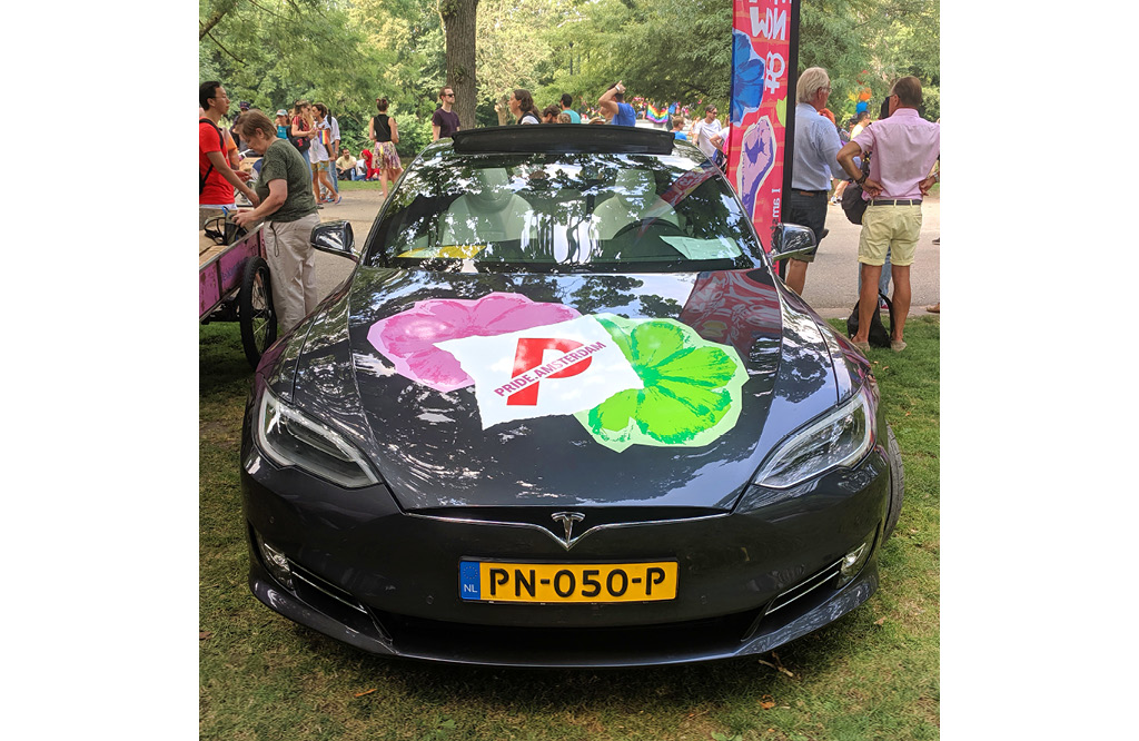
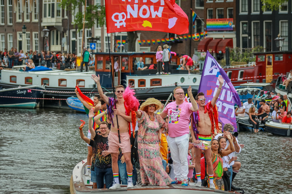
Pride Amsterdam 2019
A riot of colour
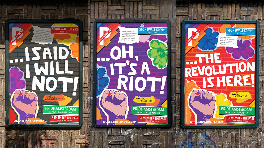
Typeface and brand identity design 2019 marked 50th anniversary of the 1969 Stonewall uprising in New York when the LGBT+ community stood up against police harrassment. Many of the same people lead the first Gay Pride march in New York the following year. Pride Amsterdam wanted to celebrate this and all civil rights demonstrations with their slogan for 2019: Pride = Protest.
I took inspiration from late 60s New York; Andy Warhol, who made portraits of the trans people involved in the riots, decorating them with torn up coloured paper; and the poster for the Woodstock festival which used lettering roughly cut out of paper.
The Warholesque flowers evoke 60s flower power and the torn paper, both riots and NYC ticker tape parades. The ubiquitous fist is a symbol of uprising, with the addition of nail varnish representing the trans people that were central to the events in 1969.
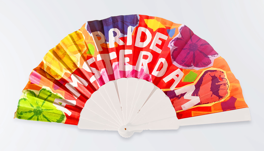
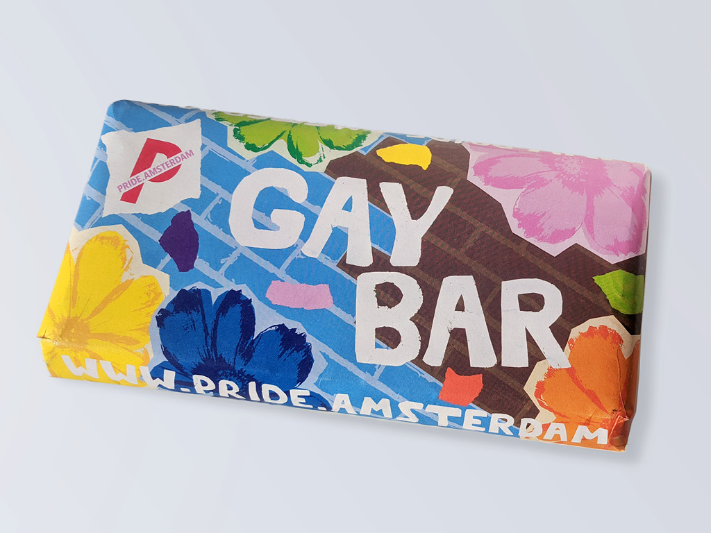
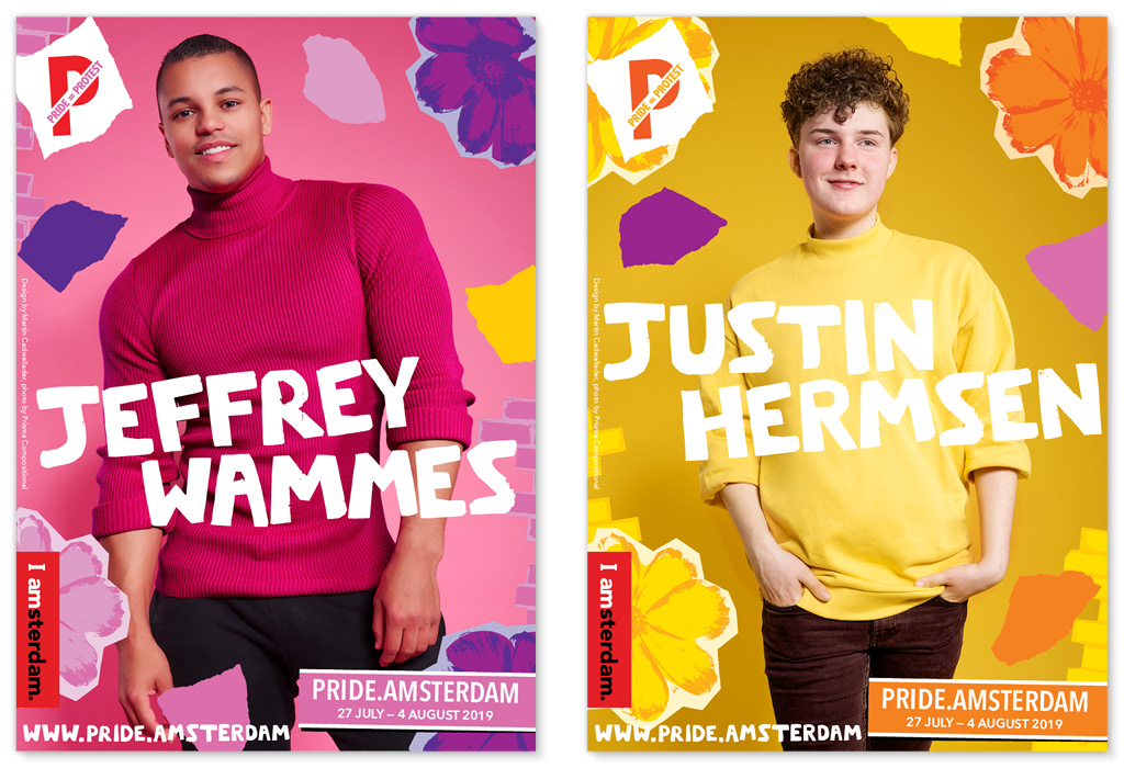
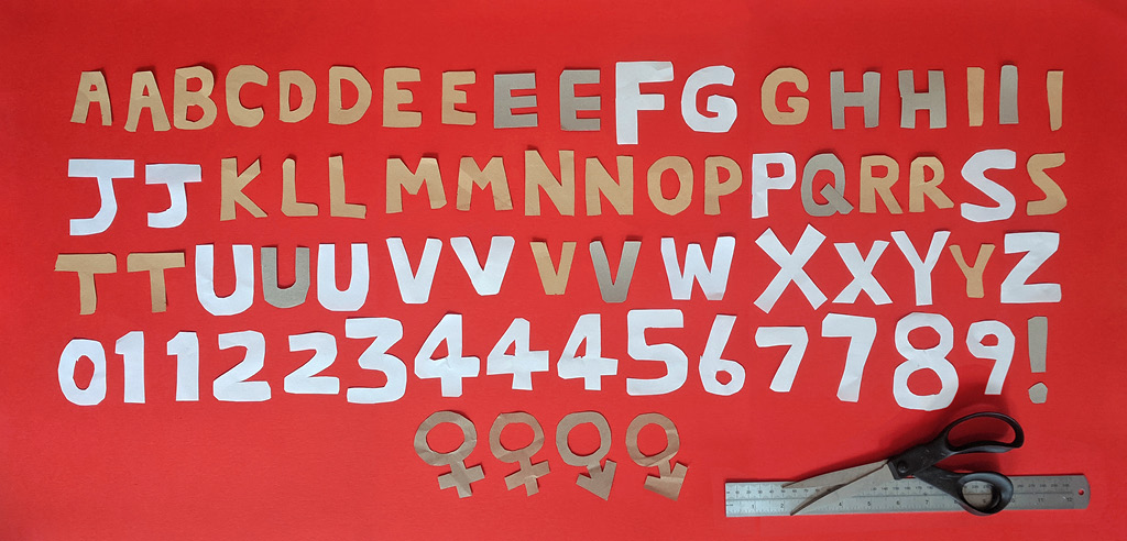
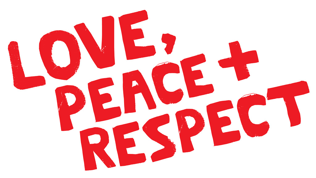
All of the lettering used in the identity was cut out of paper, blind - with no drawing out or planning. I wanted the letters to feel rough, energetic and raw.
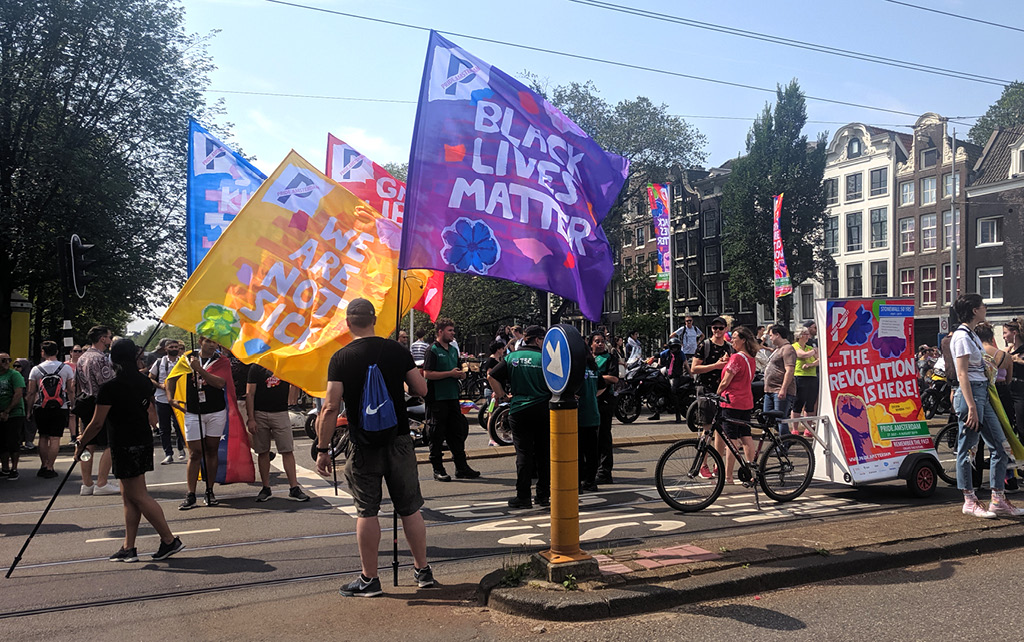
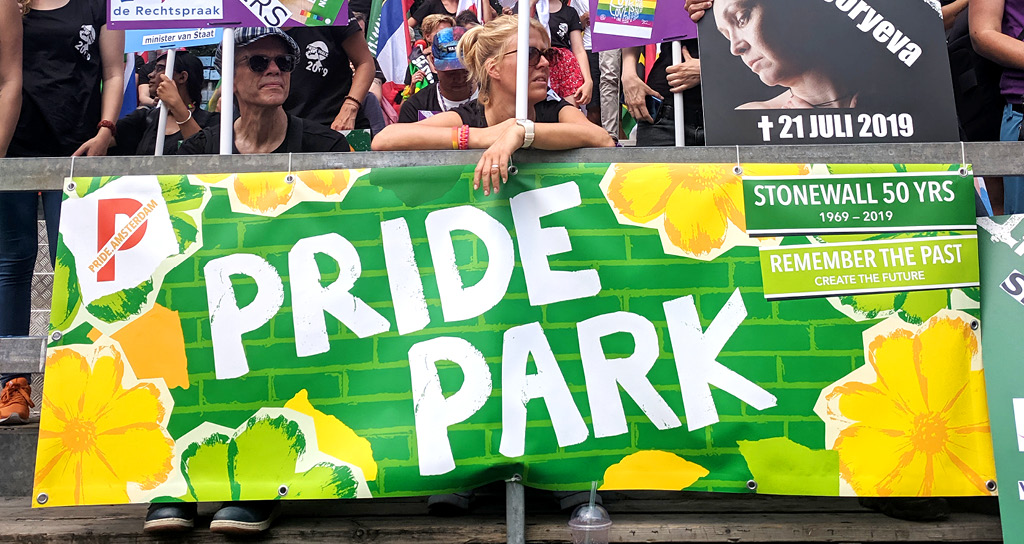
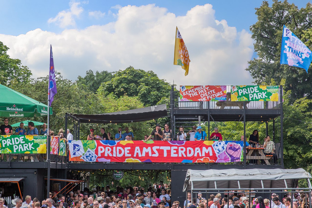
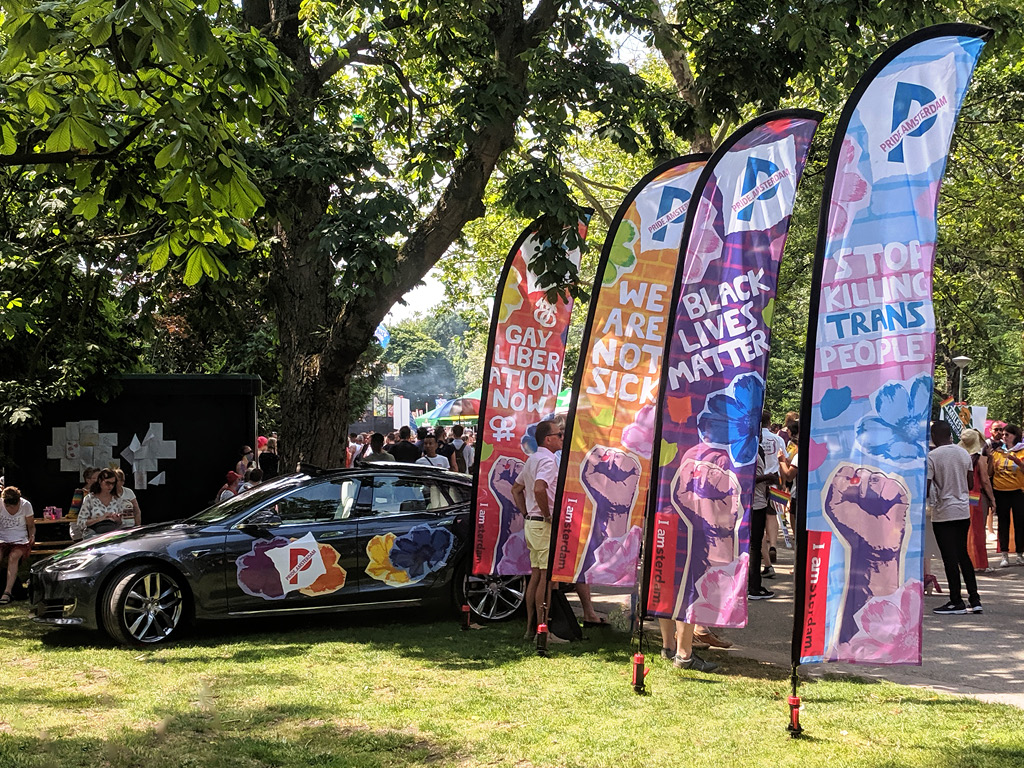
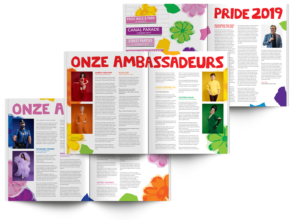
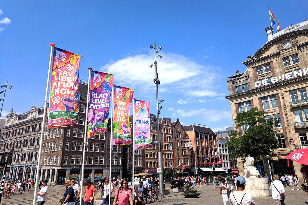
'Black Lives Matter', 'We Are Not Sick', 'Gay Liberation Now', 'Stop Killing Trans People' —Pride Amsterdam wanted to highlight and celebrate civil rights protests both historical and current with these slogans.
I found quotes from people who participated in 1969 uprising and used their words as the hero on the posters that appeared around the city in the month leading up to the event.
...I said I will not!
1969