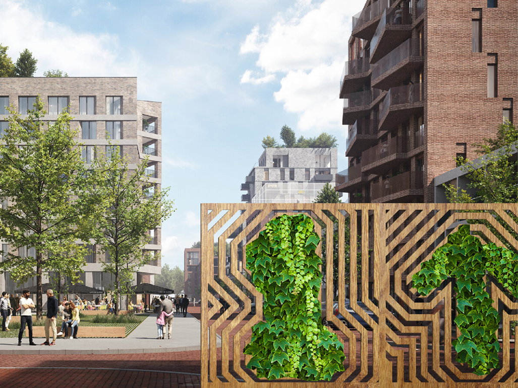
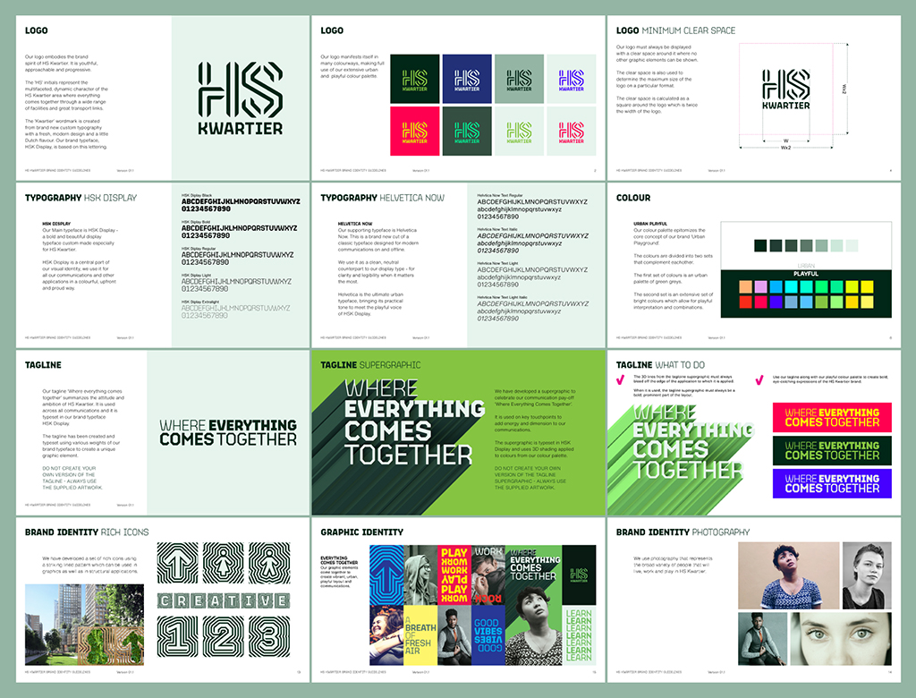
HS Kwartier
Building brand in Den Haag
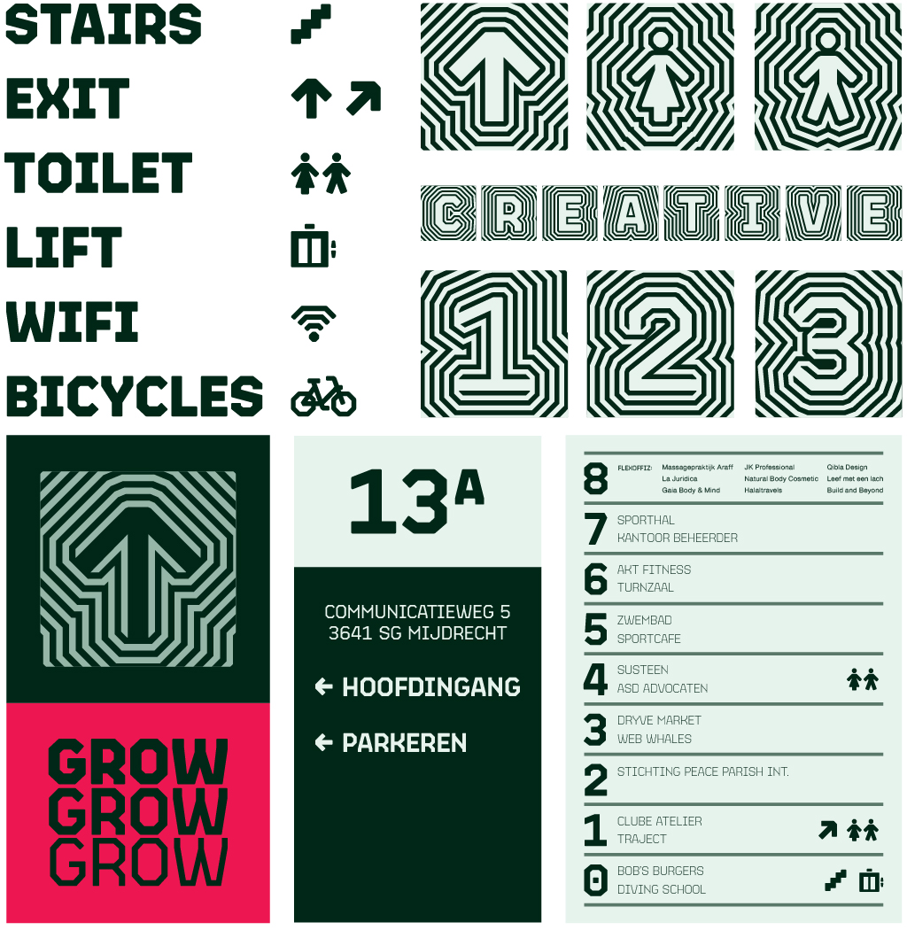
Variable typeface and brand identity design Identity for a huge urban development in the center of the Hague. Whilst freelancing at CIRCUS Studio in Amsterdam, I created a brand identity, variable typeface and updated logo to bring youthful energy to a place that will revitalise a previously run down area.
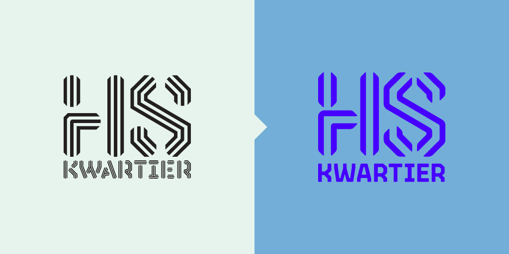
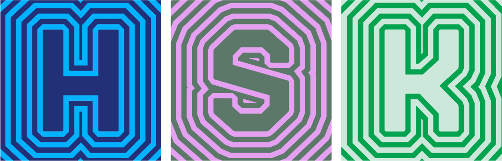
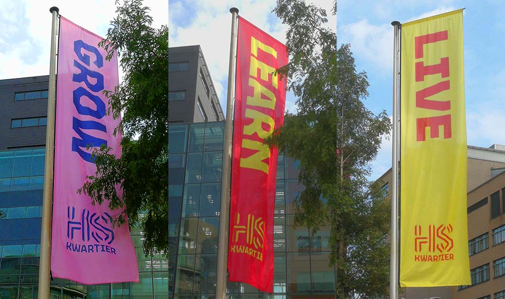
The real estate developer had already commissioned a logo by another design company which I refined into the final brand mark.
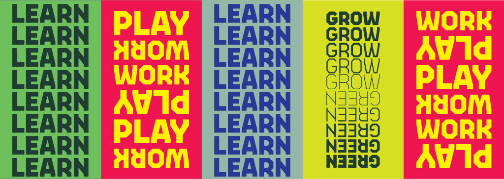
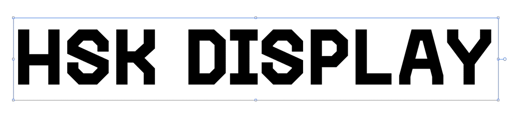
We decided to create a brand new typeface for the project so I sketched an alphabet in three weights, based loosely on the angled type in the original logo and adding some Dutch inflections. I then took this to type designer Sabrina Kipara and collaborated with her as she built out the character sets and used her expertise to refine it into a beautiful variable typeface.
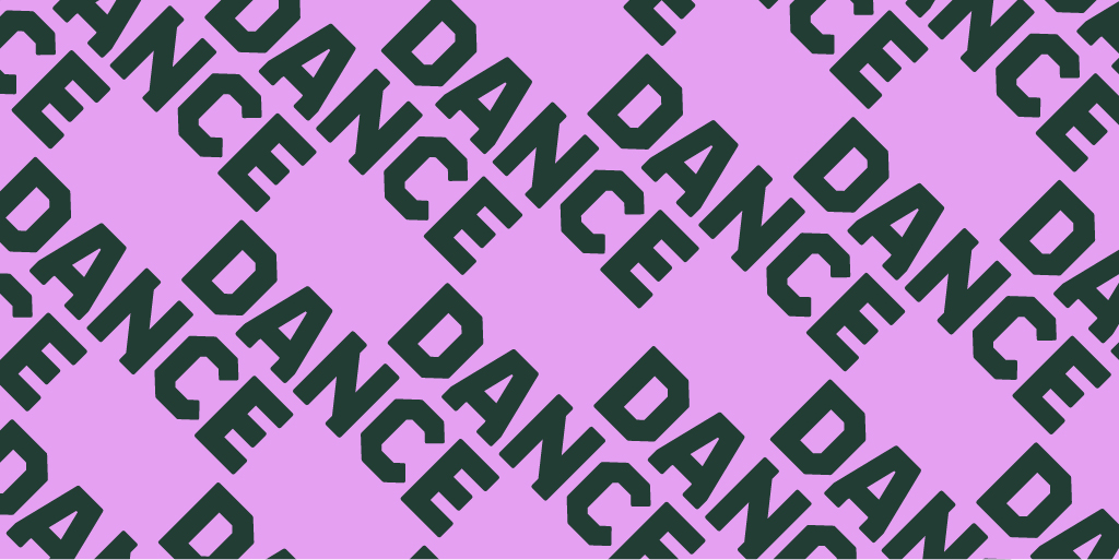
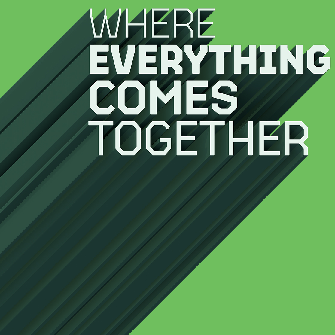
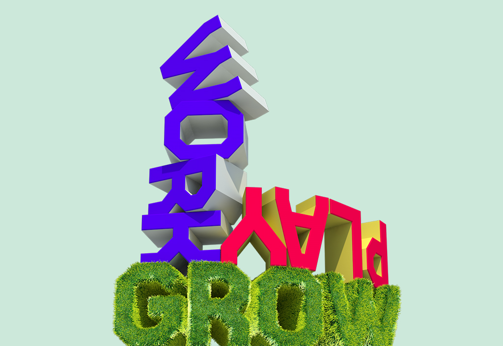
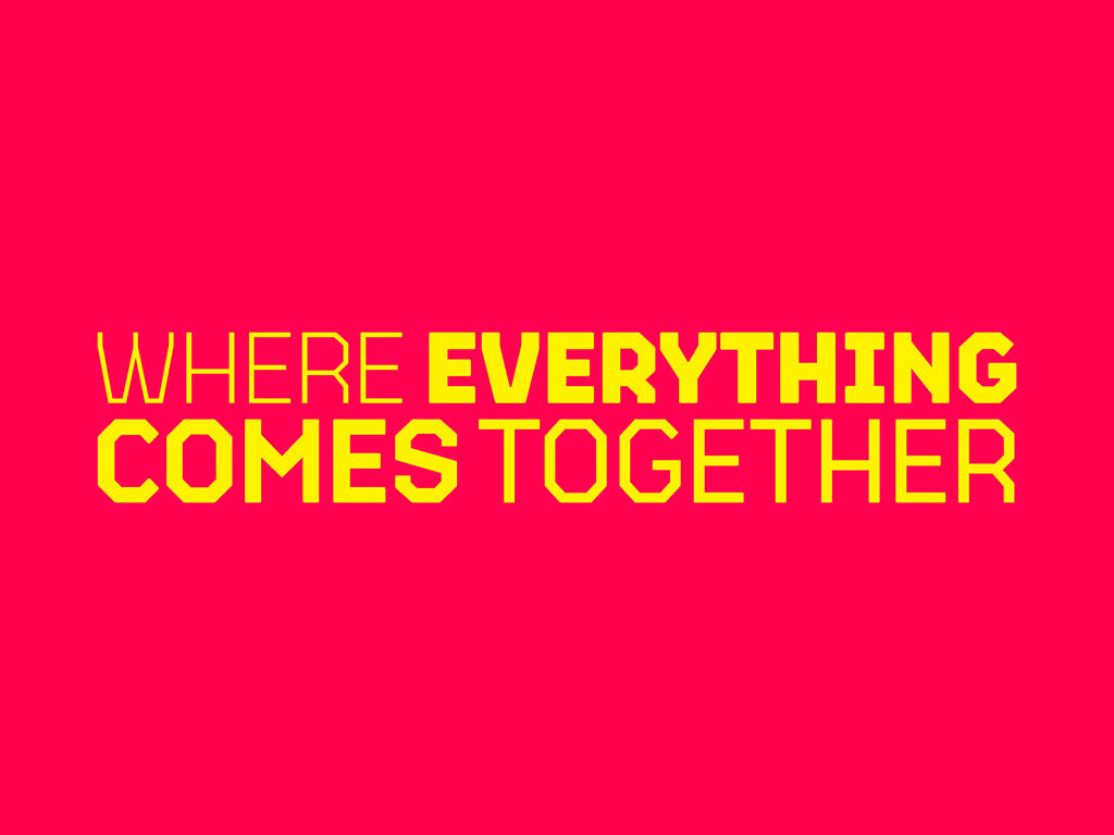
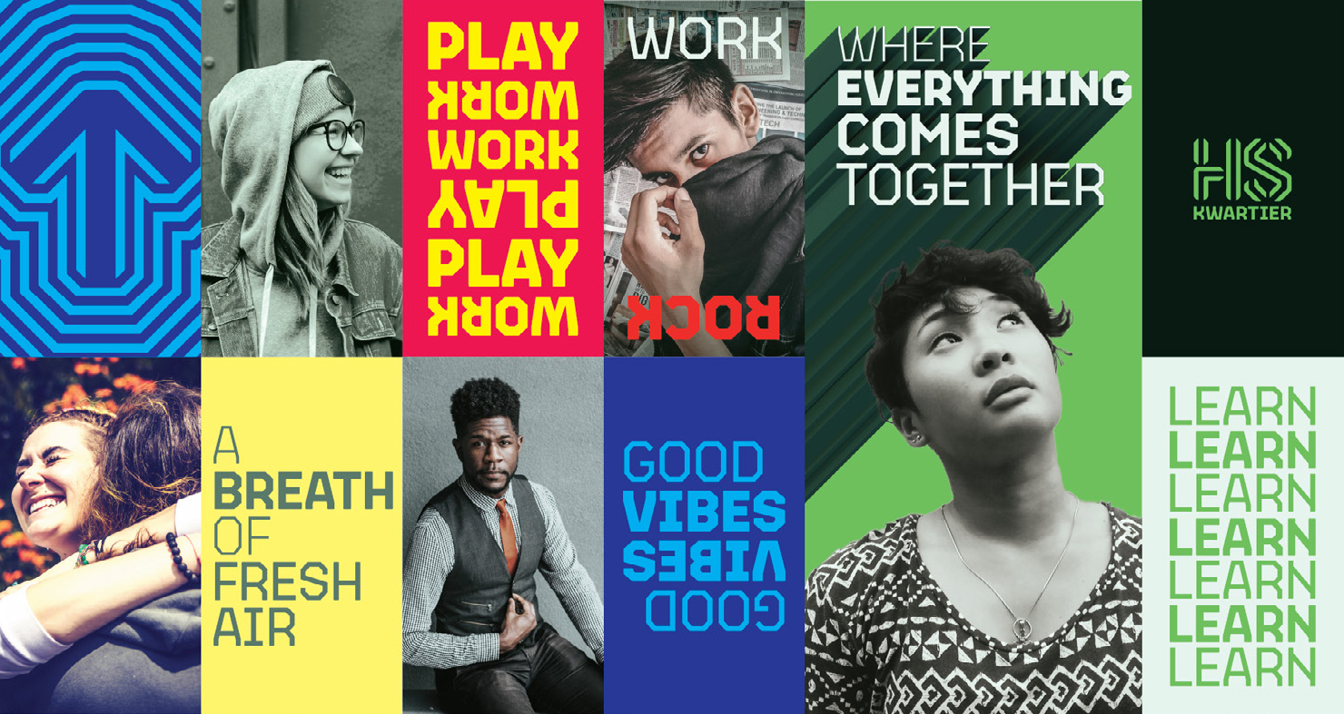
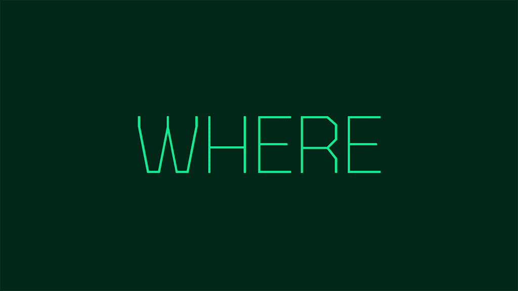
With this typeface at the core, I then built out the brand identity for a development calling itself an ‘Urban Playground’ with residential space, space for students and work space for young professionals under the communication platform ‘Where everything comes together’ developed by CIRCUS Studio.