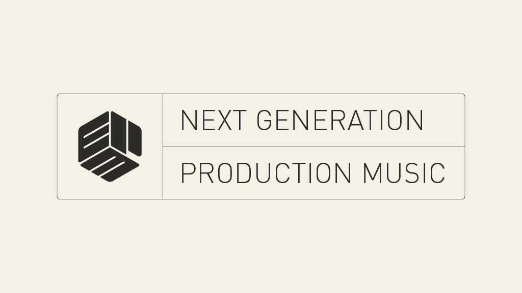
EPM Next Generation Production Music
Typographic Notes
Brand identity design and typographic experiments EPM create production music, distributed online and licensed for use in film, television, radio and other media. I created a new logo and brand identity for the label.
I created a simple graphic device inspired by labels on vinyl records which would house the logo and strapline. On their digital releases, the device carries the series name and release title.
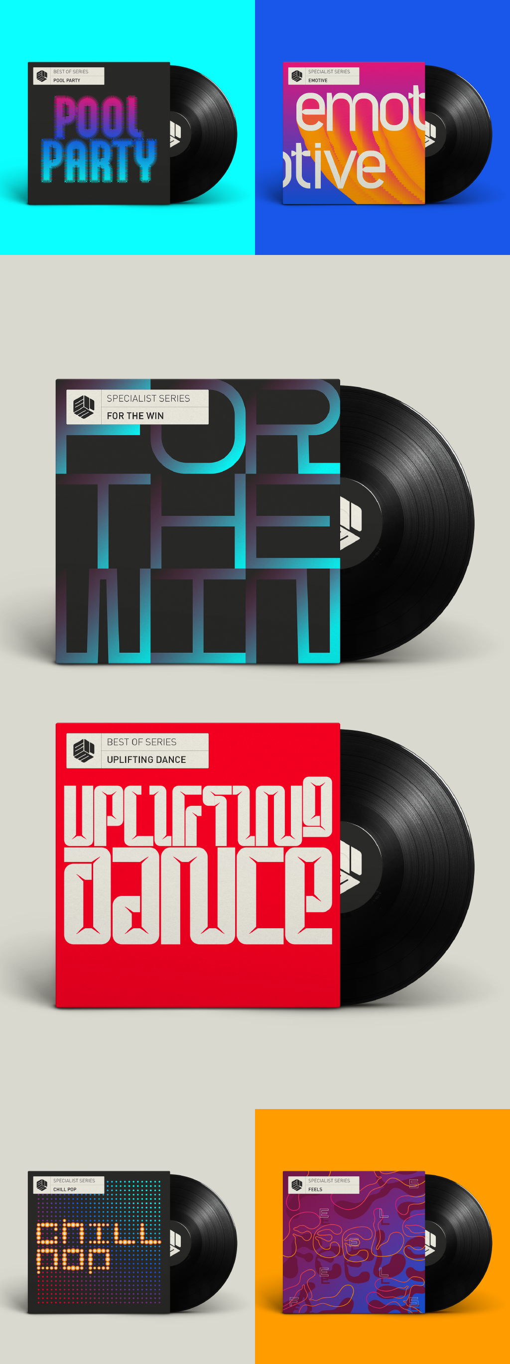
Typographic experiments used for ‘Specialist’ and ‘Best of’ release artwork.
As an ongoing project, I create the album artwork for EPM's frequent digital releases and have set myself the challenge of always creating the typography from scratch, rather than using existing fonts. It's a quick, fun, experimental way of working.


The EPM logo was inspired by spindle adaptors used for 45RPM records
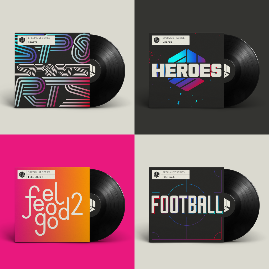
More experimental typographic album artwork
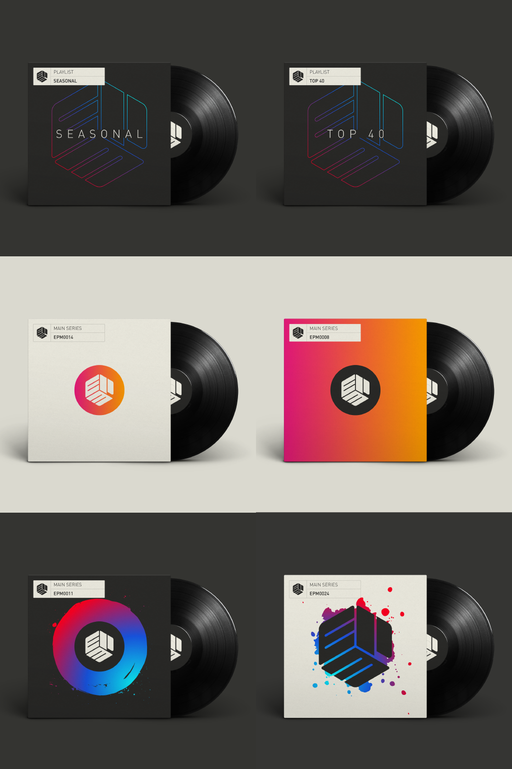
The ‘Main’ and ‘Playlist’ series rely on core brand colour and type only