Het Concertgebouw
Striking the right note
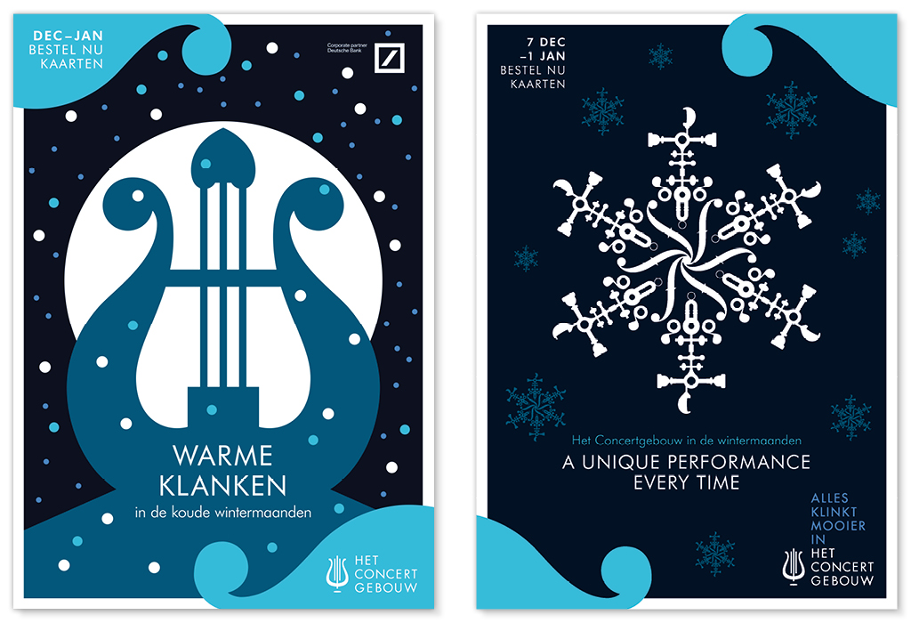
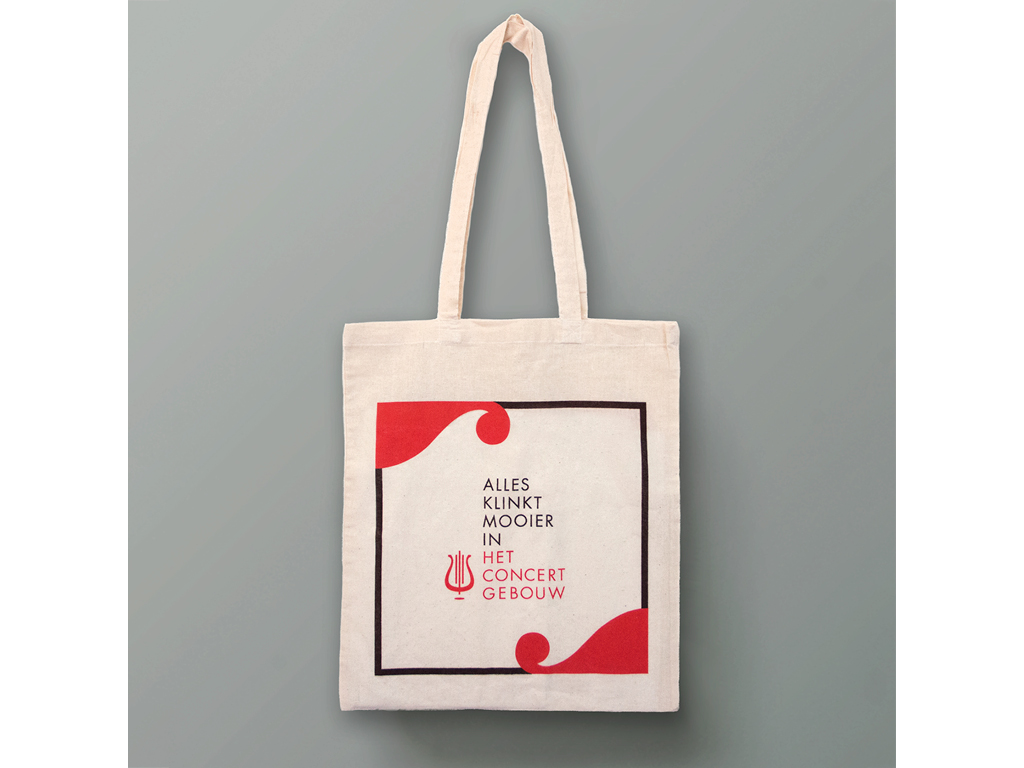
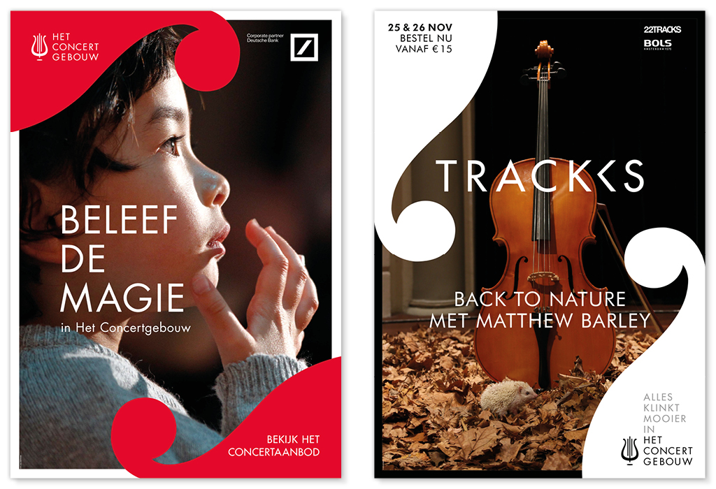
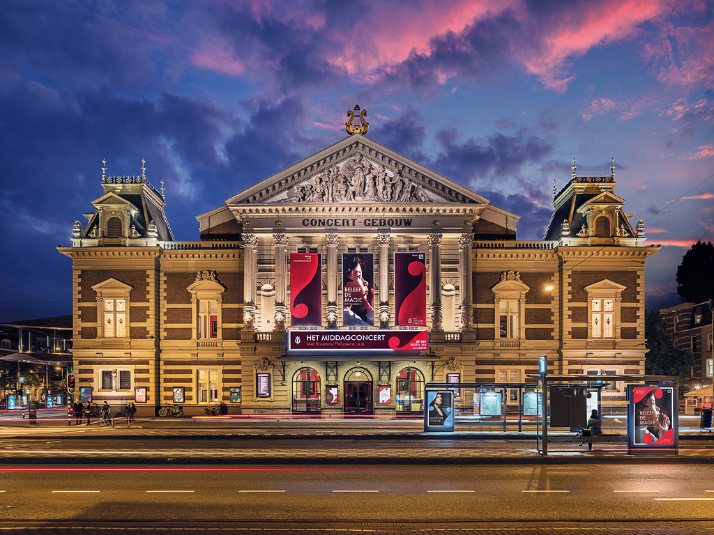
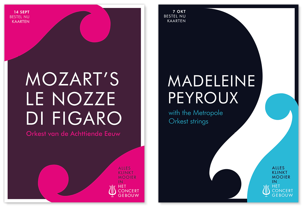
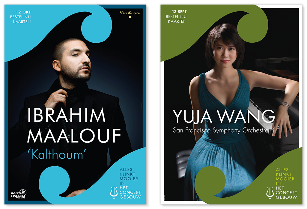
Brand Identity Refresh At VBAT I created a new graphic system for Het Concergebouw, the famous concert hall in Amsterdam, using shapes based on the huge golden lyre that sits on top of the building. The shapes create a flowing, musical, negative space on the posters and communications which gives a distictive character even when the instituion is often restricted to using photography provided by touring artists.
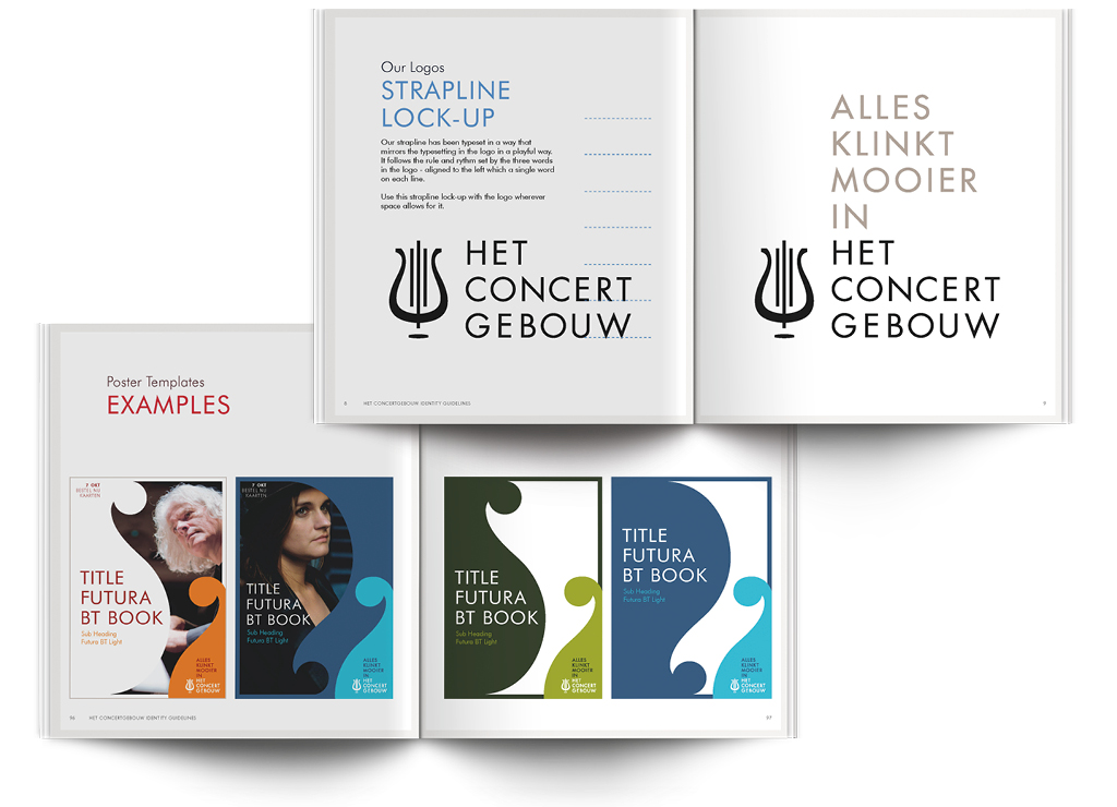
Although the old logo was retained, I created a new lock up with their strapline 'Alles klinkt mooier in Het Concertgebouw' (everything sounds more beautiful in the Concertgebouw). The strapline takes the same typeface and leading as the logo and continues upward like notes on a sheet of music.
The logo and lock up together have eight elements - the same as a musical scale, so I created these logo animations with a variety of musical scales, representing the range of types of music you can hear at the Concertgebouw.
Global Packaging Design Manager, Nestlé
Chief Creative Officer, Superunion
Founder, What Design Can Do
Creative Director and Founder, Designpolitie
Execution: It is simple, yet beautiful. It adds quality to the Het Concertgebouw brand as well as to every artist or event, advertised on the separate posters.
Relevance: It expresses the classical heritage of Het Concertgebouw, but the simple execution also makes it a modern brand, in touch with everything that’s happening in the world of classical music today.
Chairman, ADCN
Creative Director, INDIE